Recent searches
Search options

Administered by:


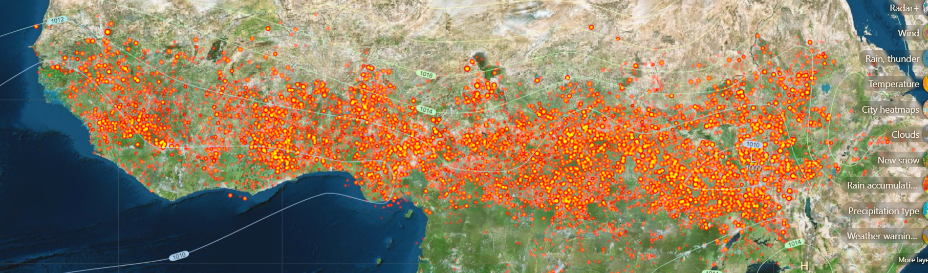
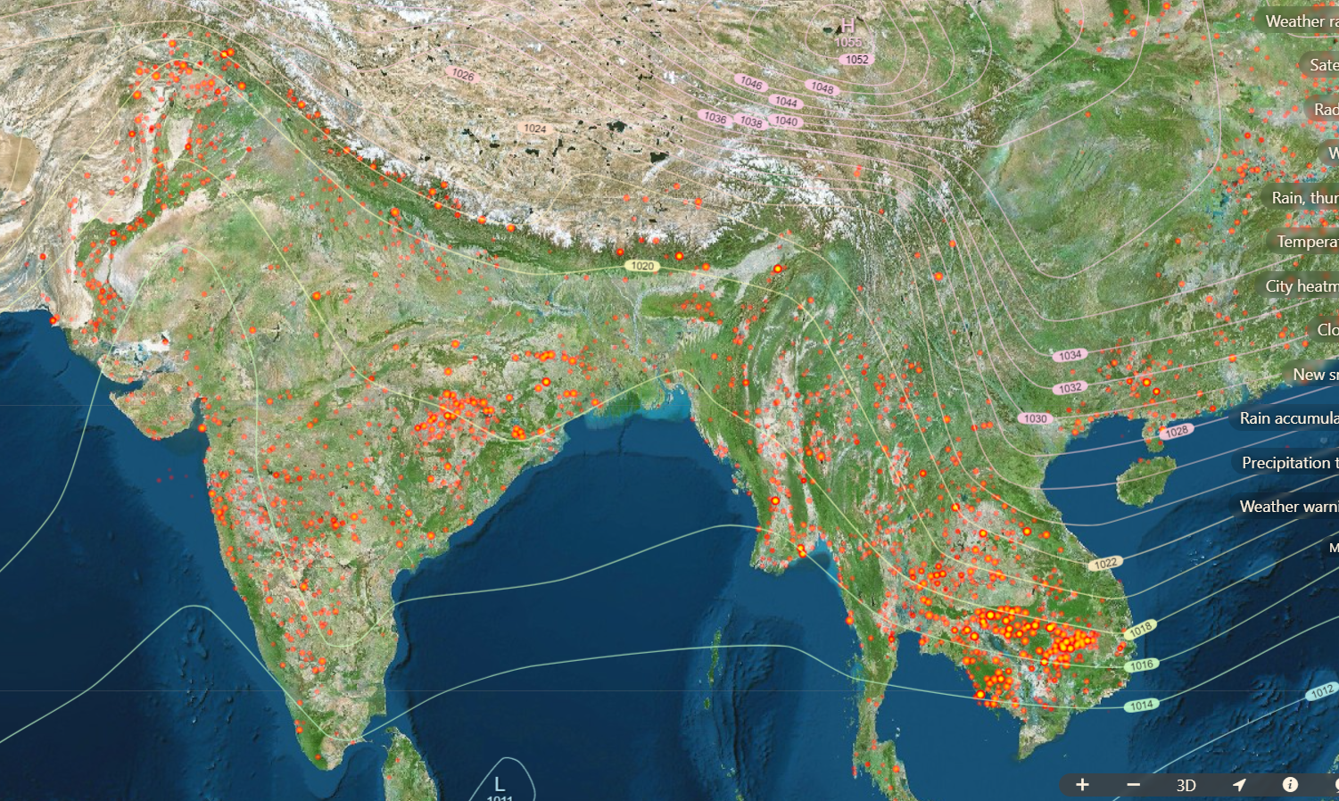
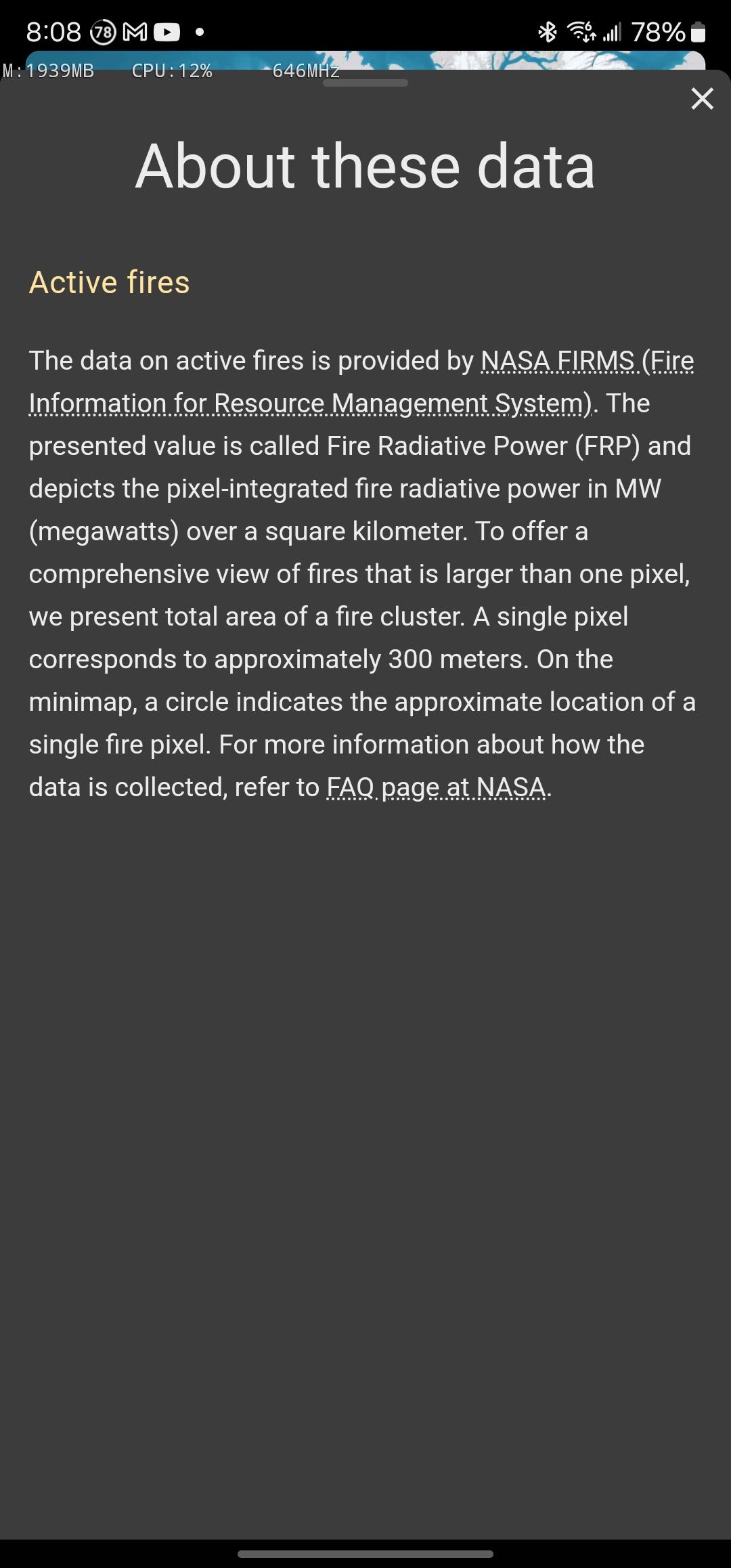
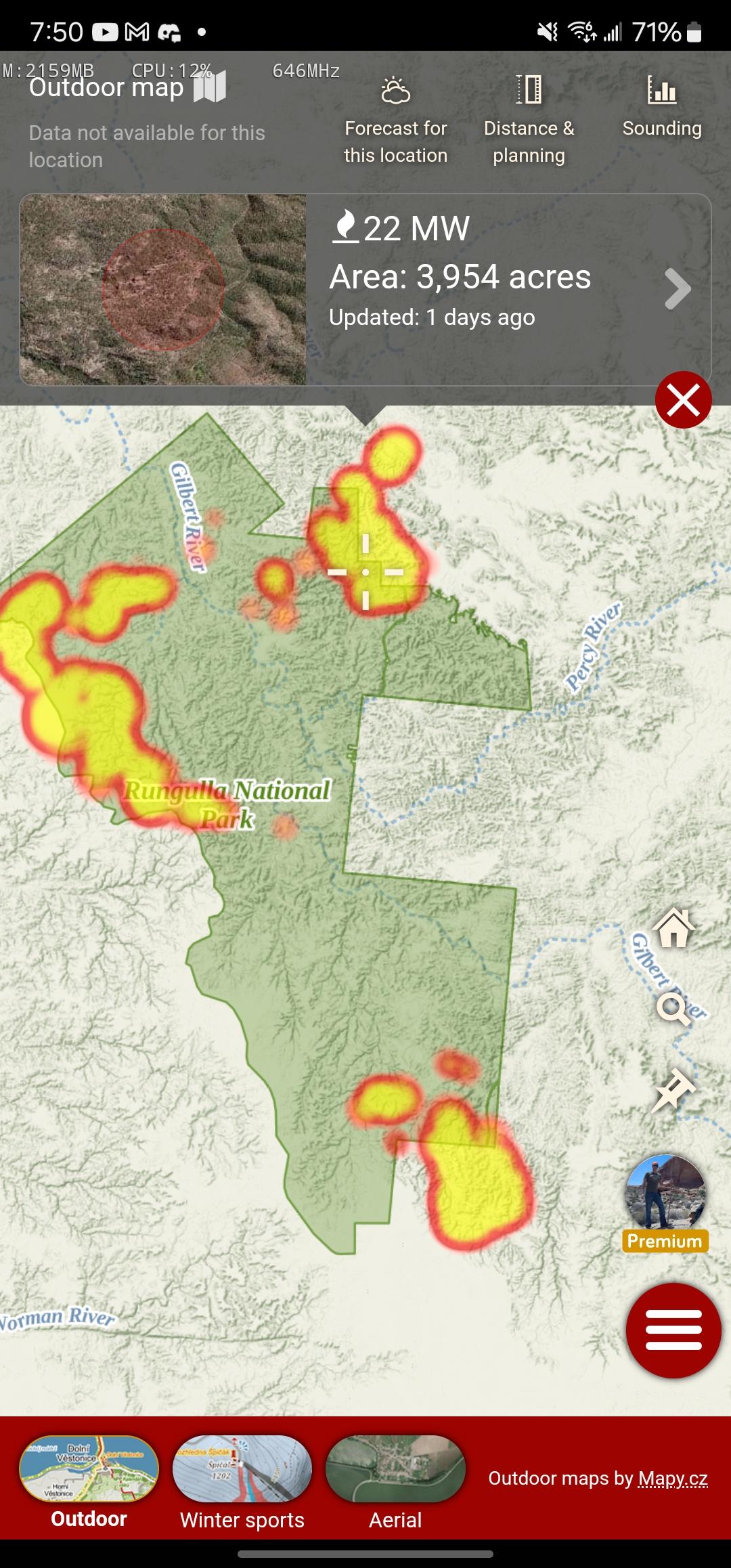
This is sad. Every bright orange spot a wildfire or some large field burning. (some of the lighter colored ones are power plants/industrial heat sources)
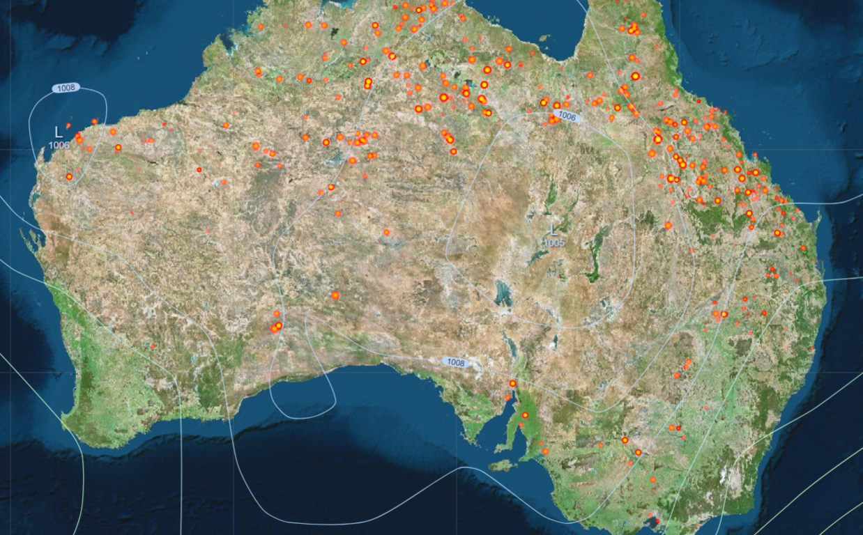


@JDGeoShack What day do those maps represent? Id like to compare the South Australian dots to fires reported by our firefighting service.
@anne_twain I was looking at windy.com yesterday, they have data from:
@JDGeoShack Interesting. I looked at incididents reported by the South Australian fire service in the last 4 days. There were two fires and neither of them were located anywhere near the red dots on today's map.
The reason I did this comparison was that I was skeptical about the map of Australia you posted. Seemed to me that if there were that many fires in northern parts of the continent, I would have heard about it. So I'm thinking that a high proportion of the red dots are not fires.
@anne_twain they could be agricultural fires. Do ya know if farmers burn off fields there?
@JDGeoShack Certainly not at this time of year. This is the fire danger period.
@JDGeoShack I dunno. That's in Queensland, about 3000 km from where I live.